Brief
This idea was born when I got tired of googling for the food ingredients listed on packaging. Instead of reading the ingredients lists and then googling mysterious names, I thought: What if there was a mobile app that could scan the UPC code of a product and give you a verdict on whether the product is “evil” or not.
Objective
Create a tool that provides an easy way for users to find out if the product they’re looking at has any unhealthy ingredients, and to read more about any particular ingredient.
My Role
As I was working on this project alone, I did everything from ideation, value proposition validation, design and testing.
What I did
- Value Proposition Development
- Competitive Analysis
- Surveys
- Personas
- User Interviews
- Task Flows
- Sketching
- Wireframing
- Prototyping
- Usability Testing
Tools Used
- Balsamiq
- Omnigraffle
- Invision
User Needs
User Interviews
First of all, before jumping right on and starting sketching, I decided to talk to the potential users and find out if anybody else was thinking this was an interesting idea. It turned out I wasn’t the only one and I even got several interesting insights.
Ethnographic Field Research
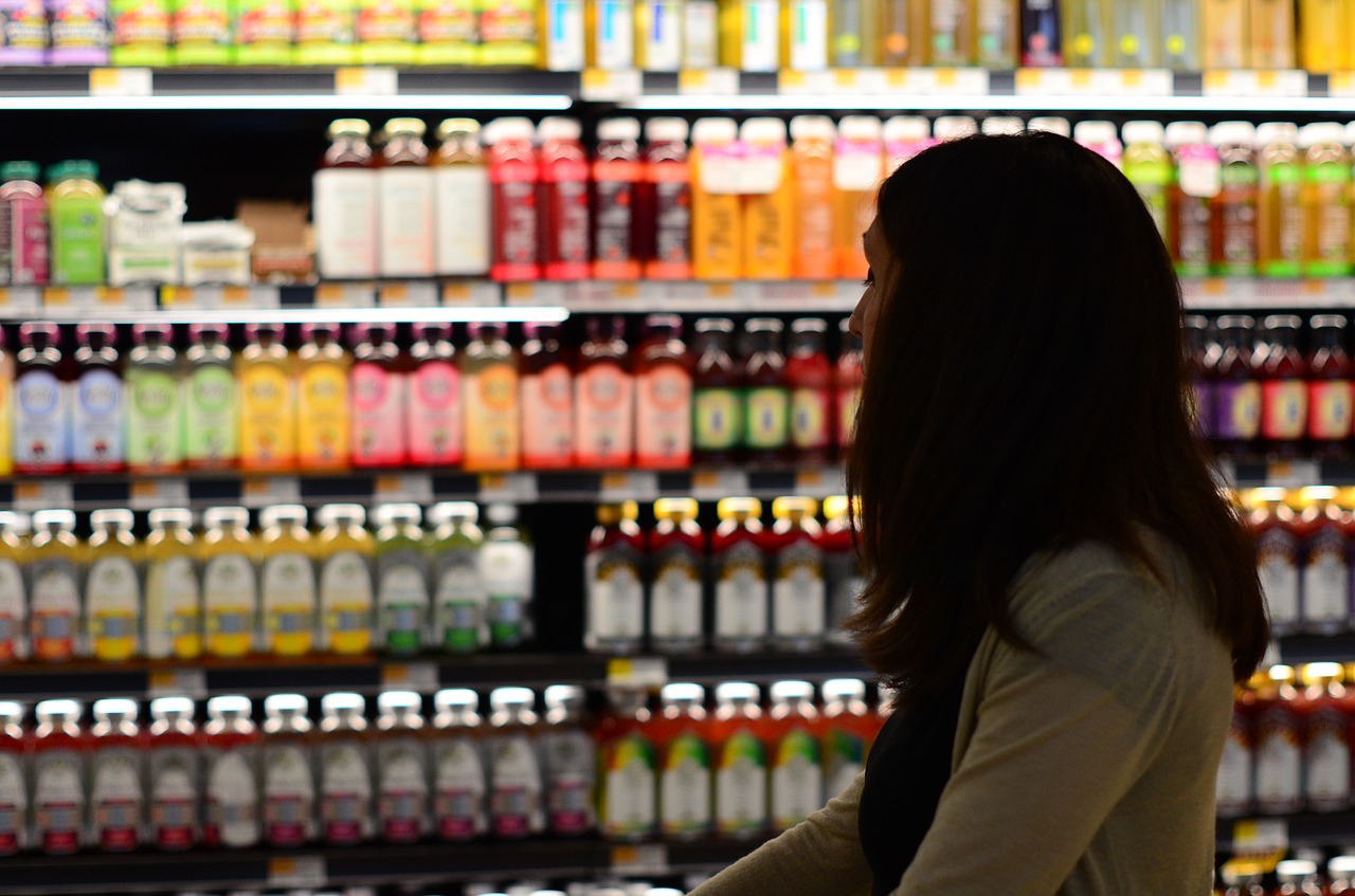
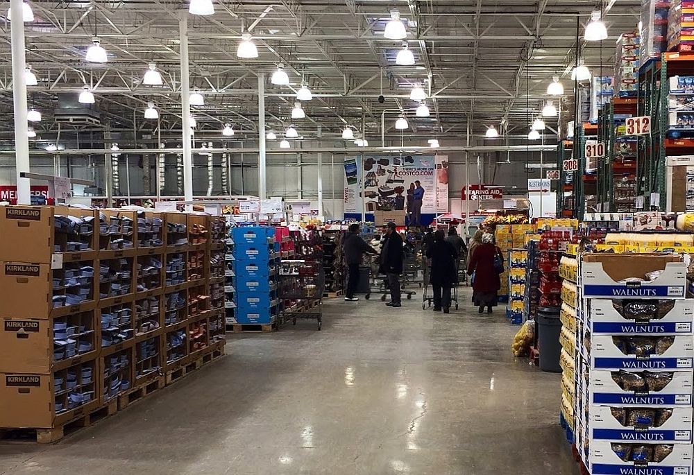
Then, I went to the local Costco store and observed how people were buying food. This is a very effective technique, as watching (potential) target users’ behaviour in their natural habitat the place where the product is planned to be used most, is one of the best ways to get to know your user. It is not always feasible to observe your users in the environment in person, but you should try as much as you can, as this will likely bring more insights into how product will be used.
Surveys
Also, I created a short survey and talked to several people there. Even though it is common to feel tempted to ask lots of questions, there have been reports that long surveys are not effective→. I like to keep it as short as I can, it helps me focus and make sure I ask the right questions:
- What do you look for when buying food?
- How often do you read the ingredients list?
- What do you do when you see an ingredient that you don’t know?
- Do you use any mobile applications for groceries shopping?
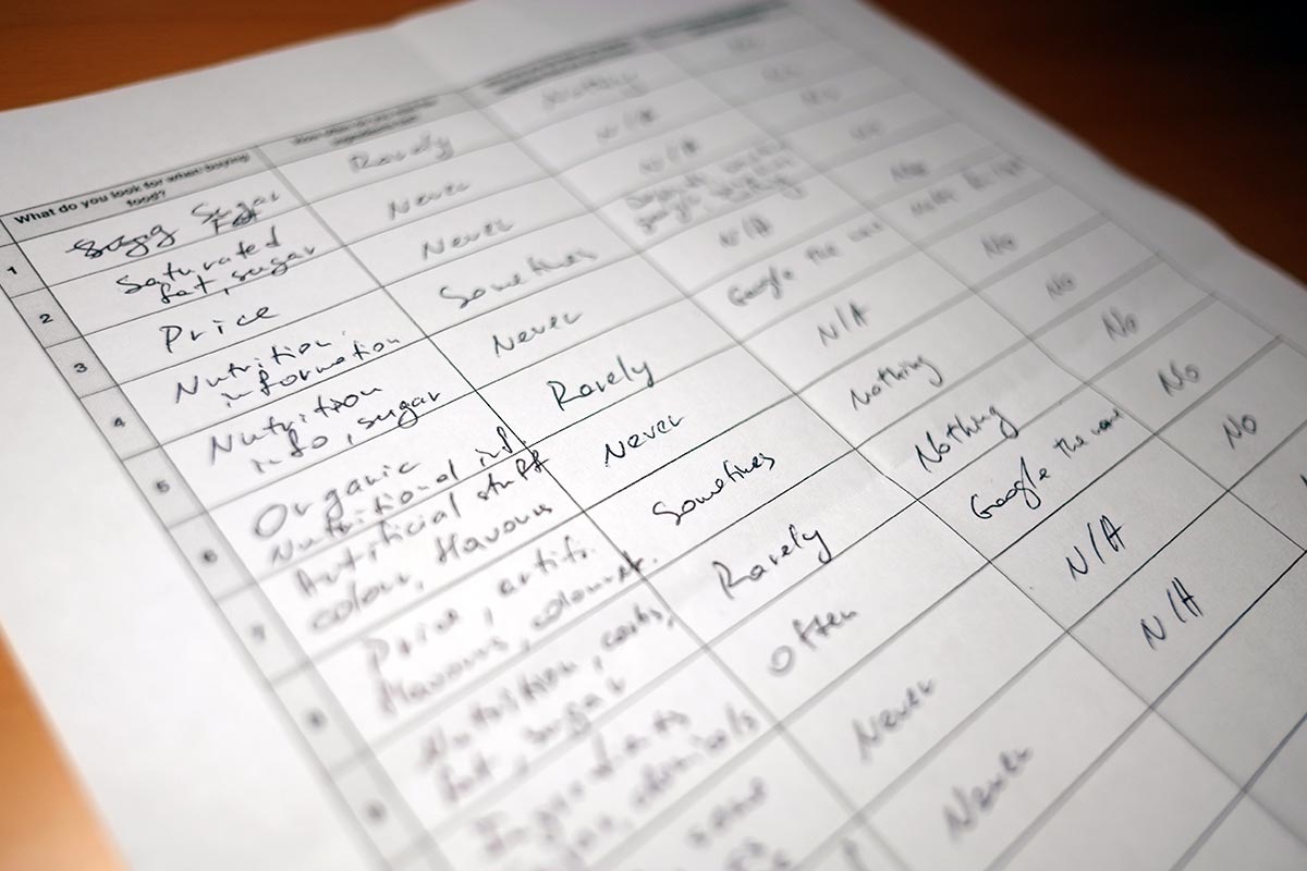
Surprisingly, the results revealed that only very few people were concerned about ingredients, and some were looking at the nutritional facts. As I am going through the process of creating a product following user-centred design methodology and not building business, I am going to continue and follow the next steps, thinking that our target audience showed more interest in this idea.
Analysis
Persona
As the app functionality is very simple, I decided to use only one persona – her name is Ann, wife and mother of 2 (4 and 7 y.o.), she has an iPhone 5 and is quite familiar with mobile apps, she is the main person who is doing almost all groceries shopping (twice a week) and she is concerned about what her family eats.
Scenarios
We should also consider the scenarios the app will likely be used in. For example, Ann has kids and they are very young, and can’t sit still and behave well for a long time, so the app has to answer her questions fast. We have our first priority – reducing the time from launching the app and receiving results. Though optimizing speed and reducing the number of steps from start to end is an important task for any application, in this scenario it gets even more important – Ann should be able to see results before her children disappear around a corner.
Next, very rarely products have the ingredients list and the UPC code displayed on the front side of the package, so Ann will have to take the item from the shelf in order to look for the information she needs, which leads us to the next focus point – the layout of the app screen should be optimized for one-hand use. The more complicated the app functionality – the harder it will be to think about all use-case scenarios and arrange control elements with one-hand use in mind. In case of this project, the scope is not that big, so it should not be a big challenge.
Ideation
Sketching
First sketches:
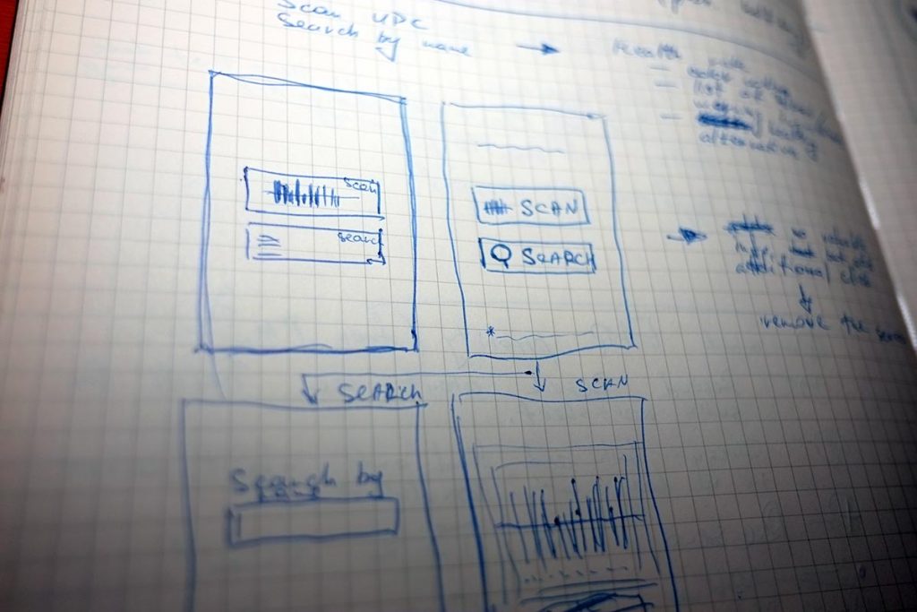
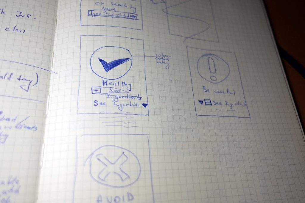
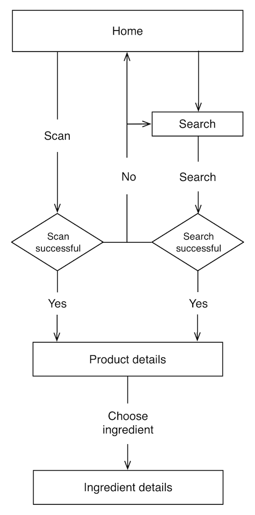
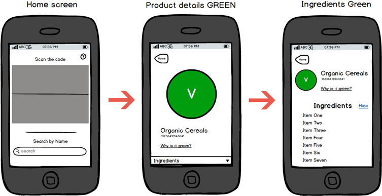
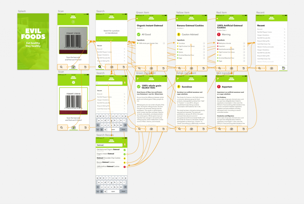
Developing the idea further – do we really need this first screen with 2 buttons? It just ads extra step, can’t find any worthy reason for having this screen, so moving scanner window and search box to the home screen of the app:
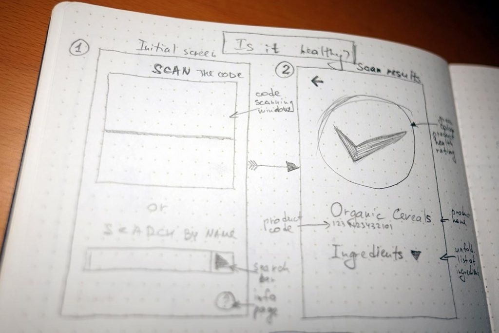
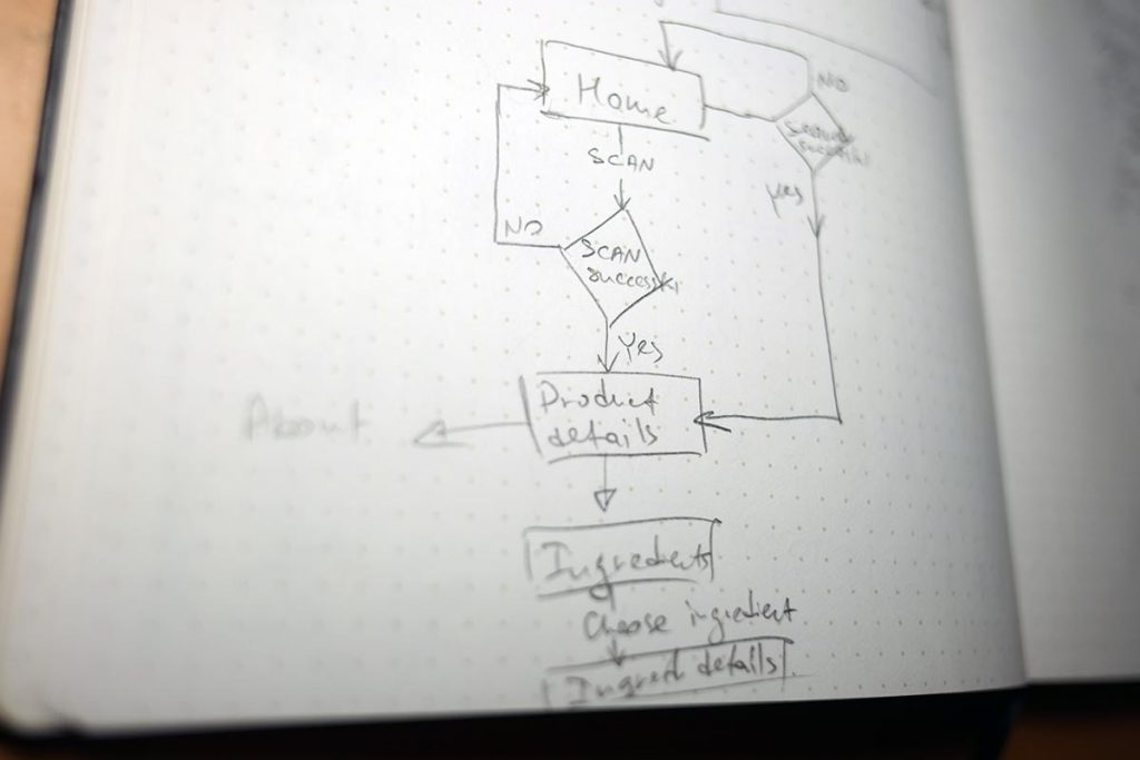
It also helps to draw a task flow to prioritize the screen elements, and makes it easier to spot if there is a step or two that could be removed without any negative impact on the user flow.
Prototyping
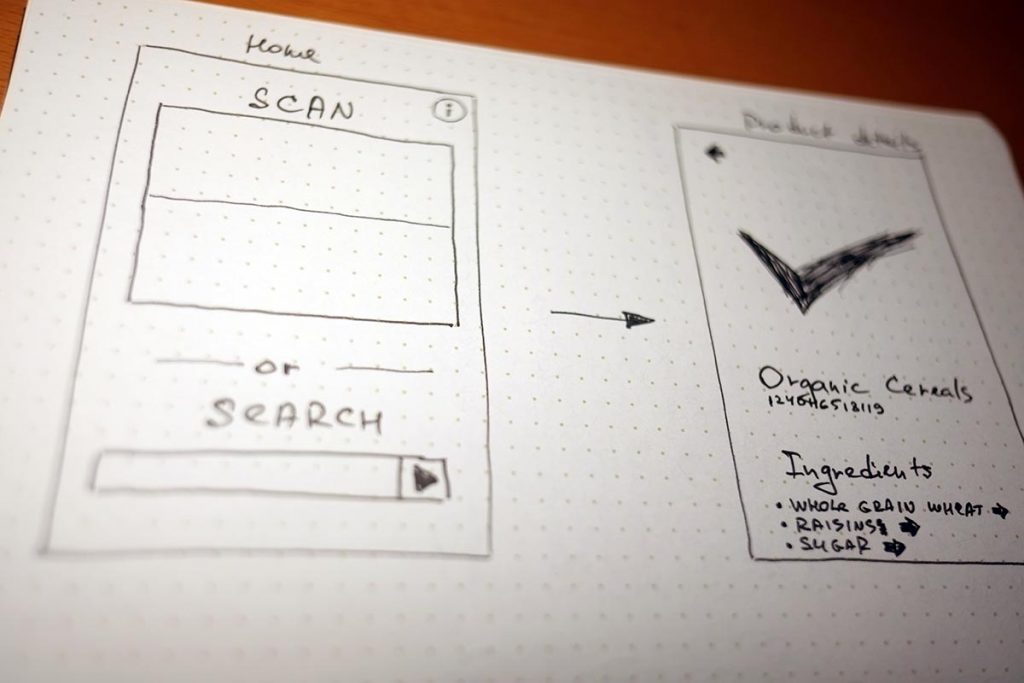
Wireframing
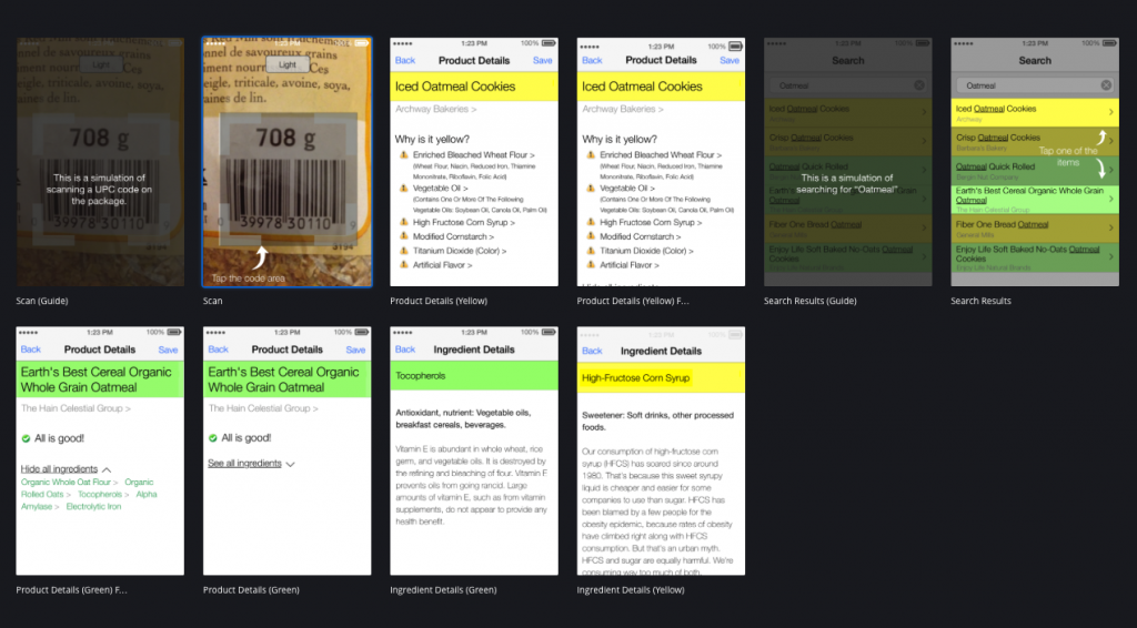
After planning the rough layout and the flow, time to get started with wireframes for the prototype. One of the fastest ways to create something you can start testing the flow with is Balsamiq. I created a clickable PDF document with all the screens inter-linked with each other.
Preview low-fidelity Balsamiq prototype→.
Testing
Usability Testing
I uploaded it to my iPhone and tested with 5 users to get more feedback about the layout and user flow. I received some interesting feedback which I incorporated into a higher fidelity prototype. If the app was more complex, and/or if major flaws were discovered after this testing, usually I would edit the wireframes and test it again, before proceeding to a more refined prototyping.
Iterating
Wireframing
Now, let’s think more – how can we improve the home screen? We have two options to search for a product: scan the code or type the product name in the search field. Taking a photo is way easier and faster, than typing, especially on a mobile device. Almost every product must have a UPC code on the package. However, the code may be unreadable due to damaged package or bad camera on the device, so we can’t rely just on the code, and should have the search option, as well. If you are trying to choose among few options, it all comes up to prioritization. And it’s not just UX design field, but any project that has multiple options and limited resources.
How do you choose what to focus on first? Let’s think how we can prioritize the elements on the home screen. How often each of the 2 main options could be used? Of course, it’s better to operate with real usage analytics, but before we build our first version of the product, we don’t have this data. Another option is to ask Ann what she thinks, but quite often end-users can confuse designer with their wishes and preferences. Lean Startup preaches Build-Test-Learn approach to for data-driven product decisions.
So, for the first version, let’s follow our guts, best practices, and common sense and assume that the code scanner option will be more popular. In fact, I estimate it to be used in more than 90% of cases. What this tells me is that maybe, search field is taking too much space and it doesn’t “deserve” it. We definitely should provide an easy way to get to it, if needed, but showing the search field on the home screen all the time seems unnecessary. How we can make it 1 tap away and not as prominent on the page? One of the obvious options is a button with an easy reach (one-hand use, you remember). According to this→, this→, this→ and this→ reports, the bottom area of the screen is one of the easiest to reach with your thumb, so placing our search button there would make more sense. After we remove the search bar from the home screen, we made it look cleaner and more tailored to the most common user scenario.
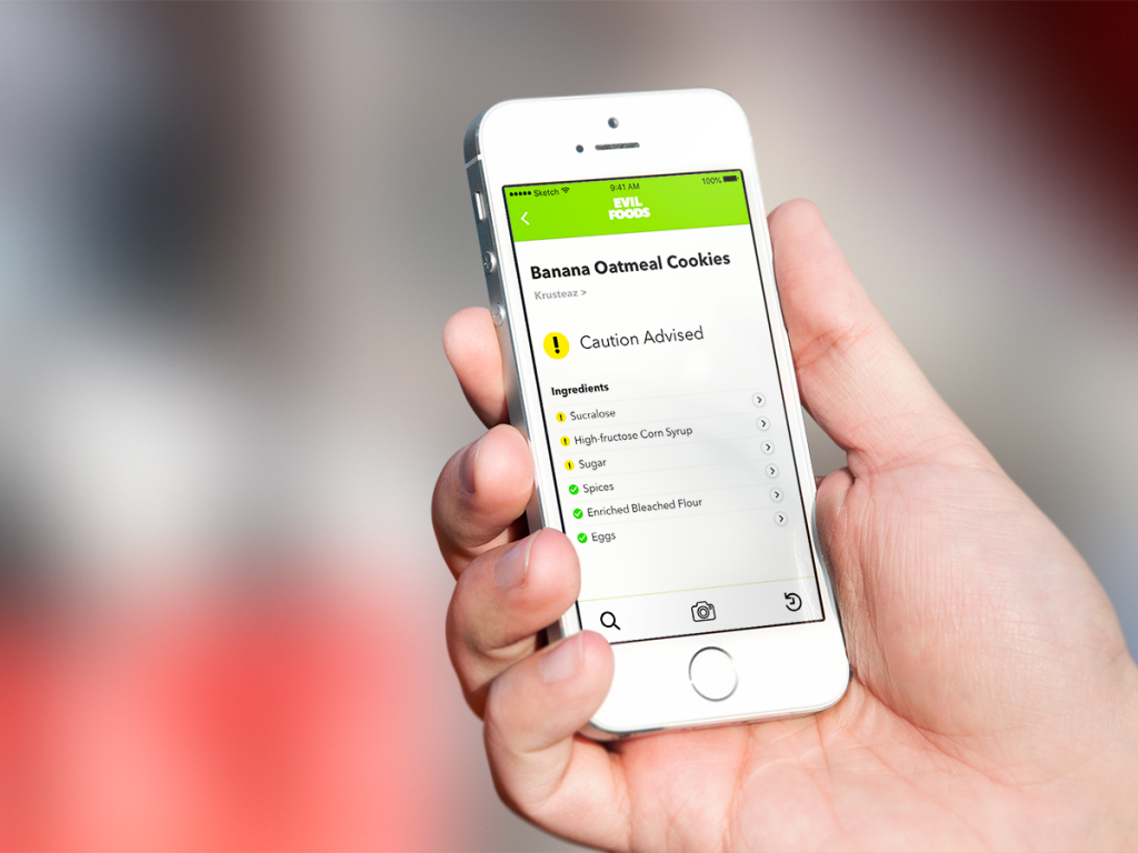
All these small changes were implemented during the next step – high-fidelity prototype (though, to be fair, it’s more like a simulation of a prototype). There are quite a few great services for creating basic prototypes fast and easy. After researching several options I decided to try Invision→. They had been spamming sending me regular emails with interviews of great designers, which were, in fact, interesting to read. This brought them additional points, and helped them get my attention. This proves my point (again and again) that better UX will bring you more customers.
Preview high-fidelity wireframes Invision prototype→.
Results
As for development, the initial idea was to utilize an existing database of products that would have ingredients specified. There were quite a few great options for databases with nutritional facts, but with ingredients – a different story. I found a couple of vendors offering API access for their commercial databases with a rather democratic cost per 10,000 calls. They provided trial access through their web interface, which I used for testing their database in one of the grocery stores. Sadly, the results were very underwhelming. Out of 10 randomly-chosen products only 2-3 were identified. Who would want to use an app that would disappoint you 8 out of 10 times? Nobody.
Another option was to rely on user-generated content, similar how MyFitnessPal allows their users to add their own products with all the nutritional information, and making them available to the whole user base. However, who would want to add a new product and select all of its ingredients manually? Nobody. A workaround to the manual input could have been taking a photo of the ingredients list with a smartphone’s camera, but image recognition is a much bigger challenge, especially considering how tiny the font size on some of the packaging was. And this is assuming people would be so passionate about contributing to the products database to spend time on this. Think about our persona Ann. What would she choose between chasing her kids in a store and carefully taking photos of each product to help me build the database? The answer was obvious.
As a result, this product concept was put on the shelf until better times.